


In our quest to improve the presentation of equity data we explored several different alternatives and the one of choice to compare absolute inequality between interventions, countries, or even time trends is the equiplot.

This is an online tool for creating equiplots developed by the ICEH | Pelotas. You can upload your own database and create equiplots using only interactive buttons and sliders (no coding is necessary).


The ICEH, in partnership with Umane, has launched a special page within Brazil’s Public Health Observatory. The initiative aims to expand public access to high-quality information on health inequalities in the country through timely, evidence-based analyses presented in clear and accessible language

A thorough assessment of the magnitude of absolute and relative inequalities requires the use of complex measures. The ICEH relies on the Concentration Index and the Slope Index of Inequality as the primary relative and absolute measures of inequality for ordered groups. Here, we provide the codes and instructions for calculating both measures in Stata.

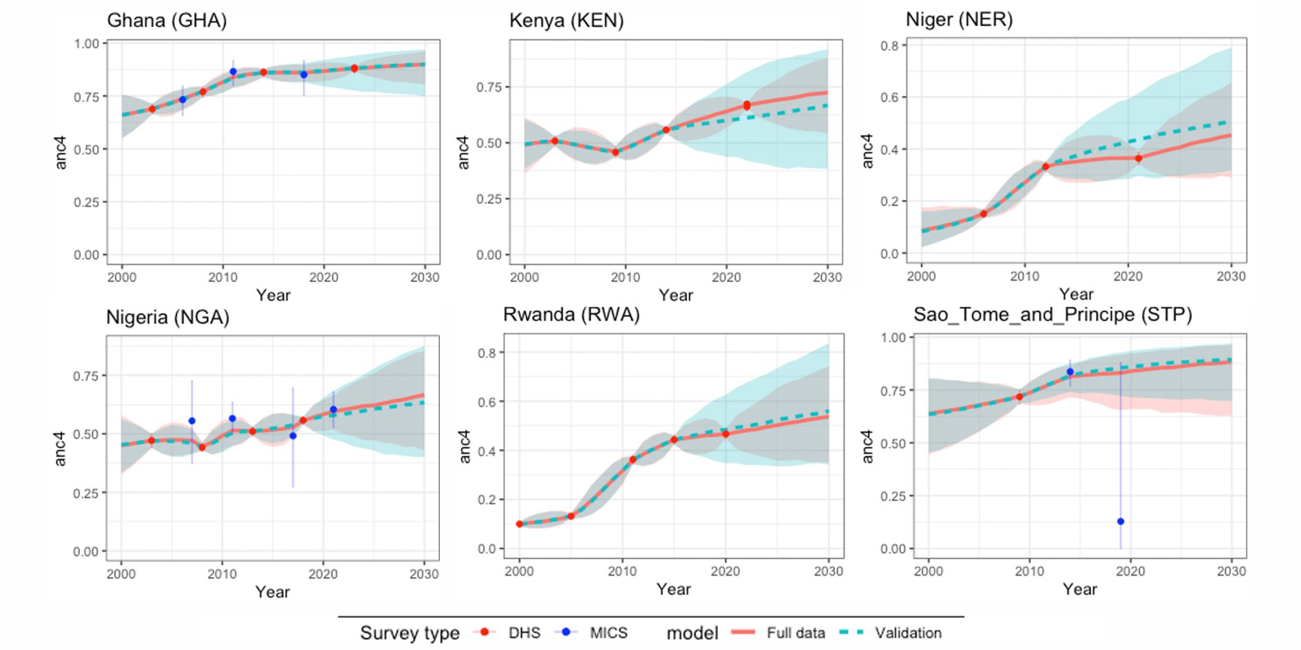
The ICEH has been doing the equity analyses for the Countdown to 2015 and will continue to do so for the newly started Countdown to 2030. For each country, a summary equity graph is presented along with the Countdown profile. We also prepare a full equity profile that includes indicators in the continuum of care stratified by wealth quintiles, maternal education, geographic region, area of residence urban or rural, and sex of the child. We present here the latest full equity profiles for each Countdown country for which we have data for