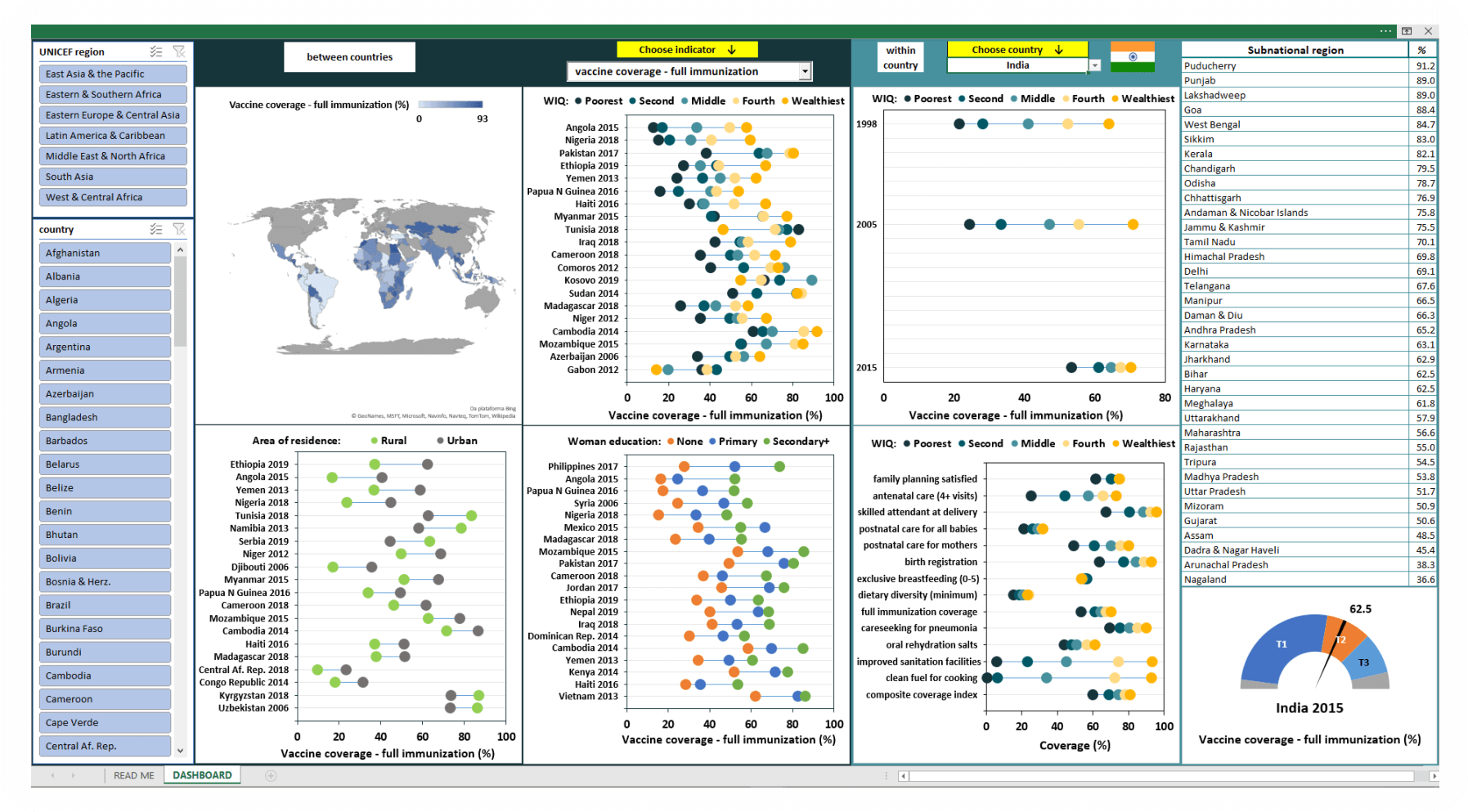
Progress towards universal health coverage for women’s and children’s health must be assessed not only in terms of national averages, but also on how well such gains benefit all subgroups living in a country, since national averages can hide persistent inequalities that need to be addressed. In recognition of the importance of equity for overall country progress, the International Center for Equity in Health created this equity dashboard to visualize data on reproductive, maternal, newborn and child health indicators according to wealth (including comparisons over time), place of residence, woman’s education, subnational region. Such disaggregated analyses of intervention coverage indicators are important for ethical and practical reasons, helping to identify which women and children are being left behind and thus equipping countries to design better and more inclusive policies and programs.

This interactive equity dashboard shows the magnitude and trends of health inequalities in 116 low and middle-income countries (plus Barbados, Qatar, Trinidad & Tobago and Uruguay). To use it, the first step is to select some fields to personalize your dashboard. The fields to be selected pertain to UNICEF regions, countries and indicators. The dashboard presents six graphs, one table and a map, and exhibits two sets of comparisons on the dashboard: between and within countries. For the between countries analysis, we have drawn a heat map showing the national estimates of a selected indicator in the indicator list, with the darker colors representing the higher coverage. There are three other graphs: estimates stratified by wealth index quintiles (the first being represented by the poorest segment of the population), area of residence (urban/rural), and women’s education (none, primary or secondary+), all of which are on the left side of dashboard. For the within country comparisons, we show, for the selected country: (1) a time trend chart with the temporal evolution of coverage of the selected indicator by wealth index quintile for all of the surveys; (2) a table with information on subnational estimates of the selected indicator for the latest survey; (3) an equiplot graph for up to 15 indicators by wealth index quintile and (4) a speedometer that shows where the country compares to the other countries on the list.
The equity dashboard is meant to provide country decision makers with a tool to monitor progress for programming and planning purposes. It was prepared by the equity technical working group team at the International Center for Equity in Health, Federal University of Pelotas, Brazil.