The equity country profile presents a series of graphs that helps on data visualization and interpretation of inequalities in reproductive, maternal, newborn and child health coverage indicators. Disaggregated analysis allows decision makers to design more ethical actions and programs leaving no one behind.
It is important to highlight the summary indices for health intervention coverage used in this profile. The first one is the Composite Coverage Index (CCI), which is a weighted measure of coverage from eight essential RMNCH interventions in four stages of the continuum of care. (family planning, maternal care, childhood immunization and management of childhood diseases). This allows the comparison between countries with a single measure instead the use of standalone indicators. The second one is the co-coverage indicator which is the simple sum of eight preventive interventions that all pairs of mothers and children should receive, creating an indicator that could range from zero to eight.
We have adopted the equiplot as our favorite way of showcasing inequalities as it is simple and easy to interpret. Each dot represents one subgroup (e.g. a wealth quintile). With this type of visualization, it is easy to see the gap in coverage between the groups defined by the selected stratifier.
The map highlights geographical inequalities on the CCI. Darker colors represent higher CCI coverage. In the map, CCI by wealth quintiles at national level is also presented at the bottom of the graph. There are three more graphs: coverage in selected interventions by wealth quintiles, area of residence and intersectionality between both.
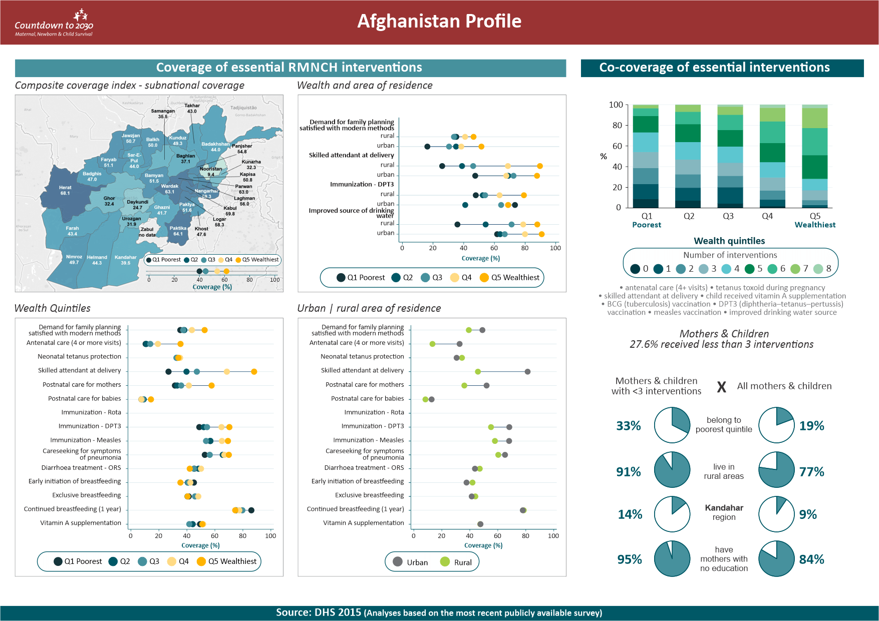 Figure 1. First page of the Countdown Equity Profile for Afghanistan
The right-hand side of the profile focus on co-coverage. The top graph presents the distribution of co-coverage counts by wealth quintile. We like to call it a tie graph. The bottom graph is an infographic where we present side by side the percentage of mothers and children who received less than three interventions in a selected subgroup compared to the percentage of all mothers and children in that subgroup. For instance, from the 2014 Bangladesh profile, we see that 52% of mother and child pairs with less than 3 interventions belong to the poorest wealth quintile, while looking at all pairs, we have 23% in the wealth quintile. That is, underserved pairs of mothers and children are strongly concentrated among the poorest.
To visualize and download profiles you are interested in, please visit the Countdown to 2030 website.